Rebuilding Global Systems Group’s Site

When looking at rebuilding Global Systems Group’s site from the ground up, the Marketing + Creative Web team took a number of things into account: organization, visual design, brand identity, and user interface and experience design.
First, we meet with the client and discuss how the site should be organized. This discussion allows us to educate and inform the client on best practices for the web and our own corporate organizational standards – and also allows us to be educated and informed in turn about the client’s products and internal organizational structure. The mix of those two viewpoints leads us to the most logical version of the new site’s structure and serves to give the client and our team a working understanding of what assets will be needed moving forward.
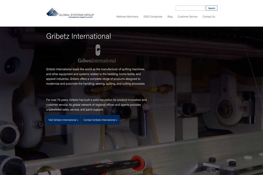
In the case of Leggett & Platt-owned sites like GSG, the starting point for the visual design and branding of the site comes from our branding rules for Leggett’s digital media. As curators of Leggett’s brand identity as it works through the web, we take the assets from the established site that make sense to keep on, discard the rest, and apply the current branding guidelines to the mix of old and new content to standardize the look and feel. Visually, we try to keep all of our sites clean and modern-feeling with lots of white space and minimalist use of color coupled with large video and photo assets. Our entire Marketing + Creative team assists in keeping our brand identity consistent as new assets are created and copy is curated and rewritten.
In the case of GSG, we initially tried a version of the site keeping the maroon from the old site as a highlight color, but in the end felt that the mix of maroon and Leggett’s dark blue brand color felt too dated. We did, however, keep and use GSG’s pyramid element for their new logo, favicon, and social media, though it stays below the Leggett logo in brand hierarchy. Keeping recognizable assets or colors from previous versions of a site or existing branding elements is always an option, but one that needs to be weighed against the existing corporate brand identity to make sure those assets still fit into the new aesthetic.
The user interface and experience (UX/UI) design of a site focuses on how a potential user will interact with the organization, branding, and visual design of the site together. In designing for web, we need to keep in mind important psychological principles like Jakob’s Law, which tells us that users will expect an experience similar to that which they have on the majority of the other sites they visit. We therefore need to keep the basic “furniture” of the site consistent with the majority of other sites: the navigation is at the top of the page, the logo in the top left of the page will take you to the homepage, etc.
What we need to focus on, then, is the ease of use and clarity of message of the site. We uncluttered the homepage and created a clearer hierarchy and main call to action, and then did the same for the product pages. We took the navigation menu that appeared in two places and doubled up on some information and turned it into a cleaner, simpler top menu that expands on hover to give a user a top-down overview of the site’s structure without requiring a click. This increased clarity is more visually pleasing, but also serves to decrease the user’s cognitive load and allow a faster selection with less need to guess or “click around” to find what a user is searching for.
Overall, the new site seems lighter and cleaner, though we haven’t deleted much content at all, and it provides a much more intuitive user experience for GSG’s customers. Products are easier to find, and content is more logically organized and displayed. Pages that were hard to access before can now be easily promoted and leveraged by the group. The design feels more modern and much cleaner, and it fits in with other modernized and branded Leggett sites, while maintaining some of the older branding that GSG customers will recognize. The adaptation of existing content and the creation of new content that fits Leggett’s brand identity provide site-wide consistency and gives a more unified experience across any medium through which a user might interact with Leggett as a brand. The inclusion in our efforts of modern technology like analytics and tracking on the back-end will only help us fine-tune the site and provide an even better tool for this group as we move forward.


