Adapting Branding From Print to Web
A brand is a complicated thing in practice. The act of simplifying a company’s essence down to its core and expressing it in its most basic graphical form requires an exceptional grasp of the myriad of moving parts that makes up a “brand identity.” I have a lot of respect for the ability since, as a web designer, it’s usually something that’s been done by someone else before I see a project. Most of our work in the Web Department here at Leggett is done adapting existing brand designs, usually originating from our Print or Events departments, for web. In some ways, it’s much easier to adapt existing branding than to start totally from scratch. The entirely different restrictions imposed by web—especially versus print—do pose some unique challenges in creating an effectively branded web experience.
First and foremost, the web experience is based around the user. As Akar Sumset discusses in his article on brand identity, the user must come first. In web, we usually break this idea down into User Experience and User Interaction. In print we have the luxury of knowing exactly how a user will view and interact with a design: a magazine ad will be roughly the same size, same colors, and same configuration as the designer’s vision. In web, users experience a design on a multitude of devices with different view sizes and configurations, not to mention quality of display or technology. When we design a site, we can make specific provisions for a few specific sizes, but it’s often more practical to design (as our team does) using a set informational hierarchy and expanding the visual design via progressive enhancement. This lets us keep a basic visual style but allows for a huge amount of flexibility in how a design is displayed.
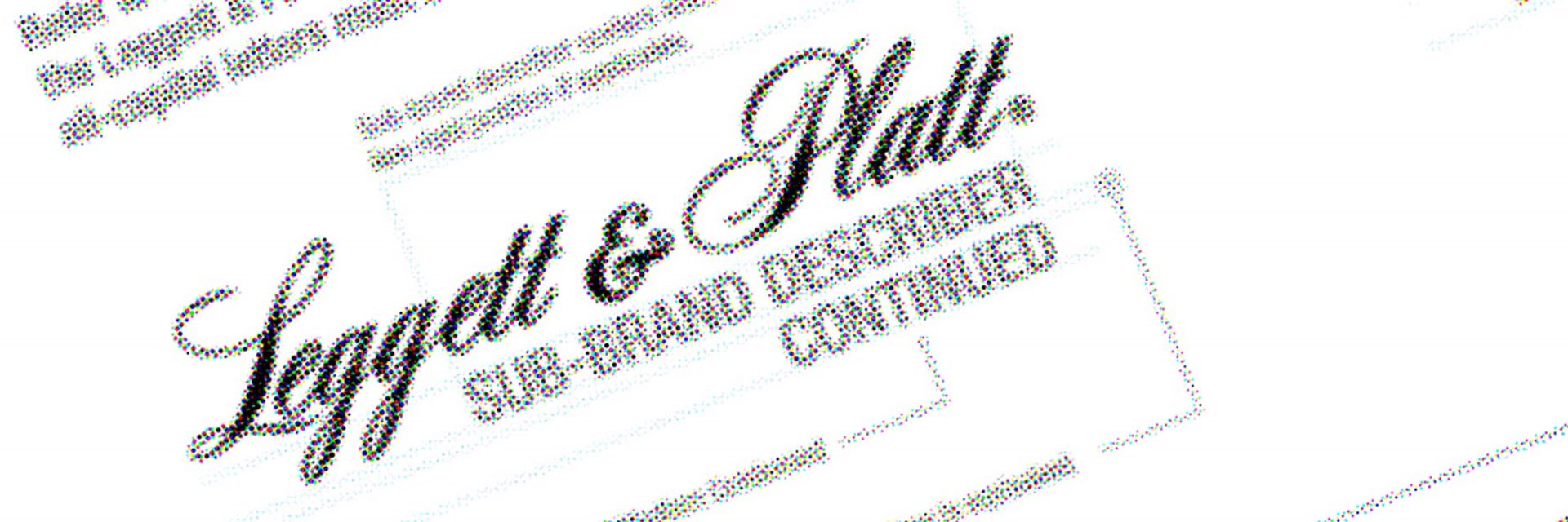
So, then, how do we create that basic visual style when starting from branding or design that is built for print? In our case, predominantly by breaking down the design to its key pieces: color, hierarchy, and message. Color is pretty simple for our web branding. We use our Leggett Blue as a brand color for anything that falls under our corporate umbrella, and typically another contrast color for interactive elements. Any other colors should be subservient to those two and the white/negative space surrounding elements. Using color like this both reinforces Leggett Blue as the strongest brand color and helps sites that are presenting very different kinds of data stay visually similar. The use of a strong accent or highlight color lets the individual site have a bit of individual flair, often using an existing color associated with an older branding or identity.
Using a contrasting or highlight color for interactive elements reinforces the place of interactivity in your site’s hierarchy as well. Since these elements should be calls to action, or other high-level points of interest, the contrast will naturally draw a user’s eye. For this reason, the use of color must be consistent and minimalist in comparison with print sources. We often work with print materials that use color-coding systems that we then must work on reorganizing into non-color-specific hierarchies (using the gestalt principle, for example) in order to limit the addition of new and conflicting colors. UXMovement has a more in-depth discussion of color use on the web that’s a bit dated, but still very relevant.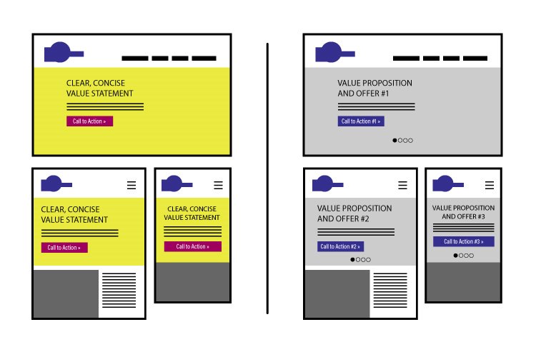
Staying true to the core message of a design is the final piece of this puzzle and can often be a challenge if we’re handed an older site with little or no user data or marketing information. Conversations with people familiar with the brand and Account Services reps on our side who have worked with the brand before are therefore a must. The messaging a site or brand wants to convey is the most important part of what we put forward and support in our designs, so we need to make sure that we understand the philosophy and messaging both that the brand wants to convey and does convey.
Equipped with this information, we can combine a clear, well-constructed message and smart, on-brand color usage to create an informational hierarchy that is not reliant on the device or format in which a user experiences our content. It is a complex process that involves many members of our team and often takes multiple discussions with clients, but it is work that can’t be skipped or done haphazardly. An understanding of the full scope of this process on the design side and the client side is the only way to make this process successful.

