Design Psychology: Hick’s Law
At the end of my grandfather’s life, he lived in an assisted living facility. He had his own apartment unit, but also had a staff of nurses and caregivers that were close by and on call 24/7 to provide medical and personal care when he couldn’t do many of the day-to-day activities in his life without help. One of the things that became more and more difficult for him was using the phone. He’d lost a few of the fingers on his right hand in a woodworking accident some years prior which, along with his arthritis and neuropathy, made it very hard to use a traditional phone, let alone the ever-shrinking cell phones that were emerging.
My mother, after many, many failed attempts, found him a phone that worked. It was a large-size cell phone with oversized buttons and a simplified interface; my mother programmed in a few important numbers and all Granddad had to do was hit the “1” button to start a call. It worked perfectly for his limited set of physical abilities and his limited need for the multitude of options that come with a smartphone. This concept of reducing a complex set of potential options down to its logical minimum for a specific user is the root of an important concept in web design: Hick’s Law.
Hick’s Law states: “The time it takes to make a decision increases with the number and complexity of choices.” It’s a psychological principle that predates the world wide web, but one that is essential in our understanding of how users interact with every part of it. Hick’s Law forms the basis of many of the offline control systems we interact with daily: kitchen appliance button layouts, the controls in our cars, restaurant menus, etc. Broken down to its most simplified form, many of us have heard it as the acronym “K.I.S.S.: Keep It Simple, Stupid.”
In everyday life, we can see this principle in action clearly in restaurant menus. Most longstanding restaurants have clear, organized menus with plenty of options, but not to an extent that’s overwhelming to most patrons. McDonald’s has a fairly robust menu, but it’s presented cleanly in categorized hierarchy that makes for an easy “tree” of decisions, i.e., “I want a hamburger,” then “I want cheese on it,” then “I also want bacon” eliminates 99% of your potential menu choices.
In web design, we need to keep that same simplified approach to our users’ cognitive load, respecting their ability to parse more than one choice, but also understanding that too many choices are paralyzing and often lead to bounces from the site. In designing site navigation, this pairs with many of the best practices involved in Search Engine Optimization, which encourages the grouping of content into “silos” of related information and reducing the back-and-forth movement of the user between these silos, thereby enabling users to find the information they’re looking for more efficiently.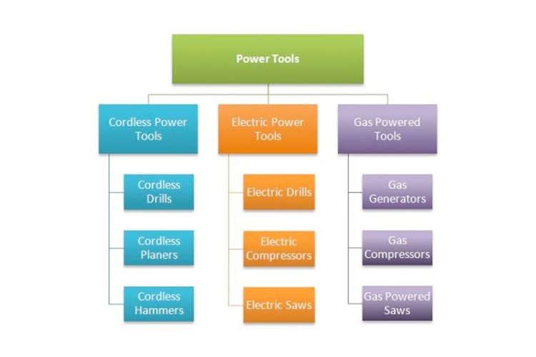
In addition to structuring navigation, we as designers and content creators need to keep Hick’s Law in mind as we think of all interactions users will have with our site. The interactive elements on a site need to be simple and direct, like forms that use input masks instead of asking the user to guess at the preferred input formatting for a field, or limiting cognitive load by paginating longer forms using the one-thing-per-page philosophy.
The overall key to getting the most from Hick’s Law in our projects ultimately comes from knowing how to anticipate our user and help give them an experience that isn’t too complex, but also isn’t oversimplified to the point of taking away content that users expect. This involves our clients knowing their customers, and it involves us working with our clients to determine an appropriate organizational hierarchy and content strategy for our sites. This can be hard work, but the science that backs up Hick’s Law reminds us that it’s work well worth doing.

