Design Psychology: The Von Restorff Effect

Web designers use contrasting or brand colors to mark interactive elements on our sites. This seemingly simple choice is an example of how the Von Restorff effect influences the way users consume site content.
“The Von Restorff effect, also known as the ‘isolation effect,’ predicts that when multiple homogeneous stimuli are presented, the stimulus that differs from the rest is more likely to be remembered.”
The effect was first explored by German psychiatrist and pediatrician Hedwig von Restorff in a 1933 study, in which she noted, “There are intensive forces operating in the monotonous lists of similar material used in classical studies of the psychology of memory; these tend to reduce the established effects of learning. Thus, items which are not presented in such a monotonous massing achieve much higher values of accurately reproduced items than those in massed positions.” Simply put, this study found that when presented with multiple pieces of information, people are more likely to remember the one that differs from the rest.
We utilize the effects of this observation in more ways than making sure essential items stand out on our sites. It is important to understand that this effect doesn’t seem to influence user choice so much that it overrides user preferences. Instead, it shows us how to best design in a way that helps users hold key items or information in their working memory. The Von Restorff effect can also show us ways to safeguard our users from potentially damaging patterns.
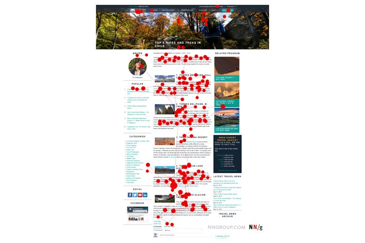
Banner blindness is a term that refers to “people’s tendency to ignore page elements that they perceive (correctly or incorrectly) to be ads.” Partially an example of Jakob’s Law in action, this phenomenon is also closely linked to the Von Restorff effect. When your site visitors see banner ads visually distinct from the regular page content, they will likely ignore that content. Ads have a way of “poisoning” good content just by proximity, as users will scan an ad and then dismiss a whole section of the site surrounding it.
While we can’t specifically influence user selection by using the effect, we can make sure the most critical items on a page get the most user attention. This practice is obviously helpful in the case of calls-to-action. Still, it can also highlight significant differences in monotonous information like specification tables or lists of options for products. Conversely, if we want equal attention across all options, making sure they are homogenous is the best way to avoid unintentionally calling one out.
The other important aspect of using the Von Restorff effect well is making sure highlighted items don’t conflict with or overwhelm aspects of our brand identity. While adding color or changing the size of specific items is an effective way to make sure they stand out and get noticed, that should never be at the expense of maintaining good informational hierarchy.
The takeaways?
- Make important information or calls-to-action visually distinct. Contrast can create helpful differentiation between your products or services.
- Use contrast sparingly, and be mindful of how and why you use it. Is the choice improving the user’s experience on your site? Or are you unintentionally causing them to ignore essential information?
Ready for a site redesign? Contact M+C.

